
BLICK BACK TO SCHOOL
Ecommerce Web App Design • Timeframe: 2 weeks • Role: Designer
Blick Art Supplies has become the largest fine arts retailer in the nation, after growing for years and acquiring some competitors. In this project the goal was to add some new digital flair to the Blick brand. In that spirit I designed a back-to-school site for Blick to feature 100 of its popular back-to-school products.
This was to be a responsive website, with a design that functioned in desktop, tablet, and mobile. It was also a challenge of information architecture, requiring a sorting and choosing of products.
This project was not requested by Blick. Rather, it's an excercise in the challenges of making a responsive e-commerce website for a company with thousands of products in its inventory.
Architecture of Information
As the largest fine art retailer, Blick carries thousands of highly specialized items. Categorizing this inventory is a challenge of information architecture. What is the hierarchy? What are the groupings? The answers are not obvious. So I did a different kind of user testing. Information architecture questions meant that 'card sorting' was a good tool to use. I made one hundred cards with names and pictures of items and asked people to sort them into categories that made sense for them.
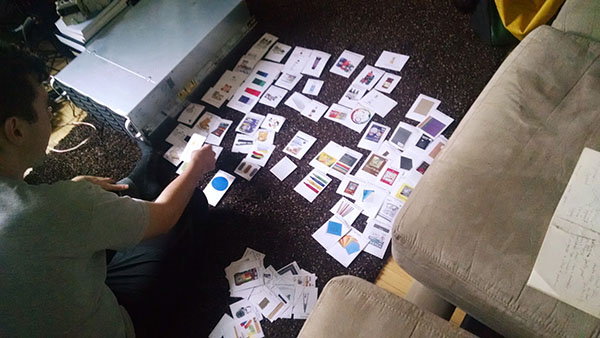
A user card sorting 100 items from the Blick inventory.
Card sorting was a challenge that some enjoyed while others found it exasperating. For many people the artist materials were difficult to understand. There were things like acrylic mediums, gesso, guache, vellum, fixative spray, wire mesh, and plaster of paris. After several users had sorted in 'open card sorts', making up their own categories, I took the time to consolidate their categories, coming up with master categories. Then I had users do 'closed card sorts' in which they fit the same cards into those categories as well as they could, which is a way to validate the groupings.
We can't assume how our users understand the world. We have to test it.
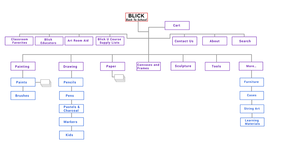
Eventually I came up with the following sitemap which portrays the architecture of information I settled on after my user research.
Designing for Back to School
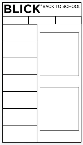
The design process was mobile-first. I started with a basic structure that would work on mobile.
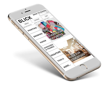
Blick has a lot of special features appropriate to a back-to-school site, like Blick for Educators, Art Room Aid (donations for art classrooms), and “Blick U Class Lists”. I left plenty of room in my site for those attractions alongside the main information architecture. The special features would be displayed on the right side.
Going to Hi Fidelity
In my field research in Blick Stores I noticed people meandering and exploring single aisles for long periods, looking and touching. I think it's because the objects of art-making are so beautiful. Blick could use this beauty to greater effect on their site.
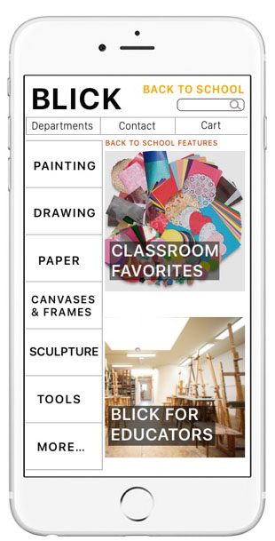
A balance between structure and content in the mobile view.
Growing the Design to Desktop Size
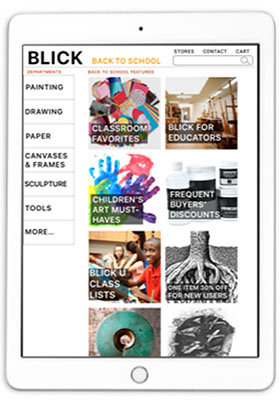
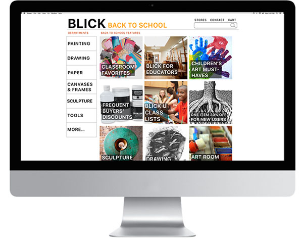
Mobile First Design Means that we set priorities and structure at phone size because it's easier to grow than to shrink down a large monitor's worth of content. But there are challenges in using the extra space well at larger sizes. Here are some tablet and desktop views of Blick Back To School.
Checking Out
One of the central challenges of ecommerce is the checkout process, which my research told me could be as many as 7 screens long for some Blick competitors. How to do it efficiently? Can it even be pleasurable for the customer? I think that if a customer appreciates a quick, effortless checkout, it can indeed be an enjoyable experience.
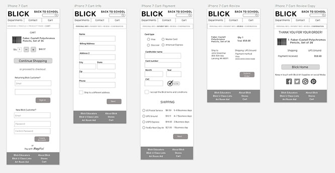
5 quick screens from cart to confirmation at phone size.
Just 1 quick checkout screen at desktop size.
Full Annotations At All Sizes
The brief called for annotations at all sizes. Below are some annotations for phone and tablet.